Designing an onboarding experience for a AI product
Relevance AI is a no-code platform to analyze unstructured data

Due to limited time and resources, additional guerrilla usability testing was conducted to determine which option, A or B, would work better for users. The testing involved recruiting 10 participants and utilizing a 3D-printed prototype (PUI) with paper screens to closely mimic the experience of using a real smartwatch in an efficient manner.
Concept validation through guerrilla usability testing

One of the significant distinctions between Gear S1 and Gear S2 was the shape of the screen, which resulted in different navigation logic and layout requirements. Initially, the navigation layout of Gear S2 was borrowed from Gear S1. However, after conducting usability tests, it became evident that users faced difficulties when using a "circular" watch screen with a "square" navigation layout.
Through empirical and theoretical research, it became apparent that there is a strong correlation between the shape and arrangement of input and output elements, which greatly influences the intuitive experience. Recognizing this relationship, adjustments were made to the navigation layout of Gear S2 to align with its circular screen shape, ensuring a more seamless and intuitive user experience.
Circular navigation design based on 'Natural Mapping'

Through an iterative process, the linear navigation layout was updated to a circular layout, leading to the exploration of four different hypotheses that considered the relationship between control and outcome. Following a team discussion, two alternatives were finalized:
-
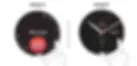
Design A: This alternative starts from the 6 o'clock position and allows users to rotate icons using the bezel. It offers a flexible app position, enabling users to customize the arrangement according to their preferences.
-
Design B: This alternative starts from the 12 o'clock position and utilizes the bezel to rotate a cursor. The app positions remain fixed, providing a consistent layout for users.
These two alternatives were carefully considered and selected as potential solutions to test out further.
1. Choose relevant metaphor
Based on user feedback, it was found that Design B appeared to be easier for users to get started with due to its alignment with their previous experience of using a watch. The interaction in Design B resonated with their existing mental model of watch navigation, making it more intuitive and familiar to them.
On the other hand, Design A was perceived as resembling a dial phone based on users' mental models. This association with a different device may have introduced some cognitive friction and made it slightly less intuitive for users to understand and navigate.
Therefore, based on the feedback received, Design B can be considered as having a stronger alignment with users' mental models and previous experiences, making it the preferred option in terms of ease of use and familiarity.
Main Findings:


2. Visibility
During the usability testing, a common issue identified with Design A was that users' index finger often blocked the app icons while rotating the circular bezel to navigate. This obstruction hindered their ability to see and select the desired app icons, causing frustration and potential usability challenges. In contrast, this issue was rarely encountered with Design B, suggesting that the placement and visibility of app icons were better optimized in that design.
The Samsung Gear S2 was developed as part of Samsung's effort to maintain the positive momentum and enhance their market positioning in the smartwatch industry. Prior to the Gear S2, Samsung had already released several smartwatch models that received positive feedback, particularly from business users.
The main challenge faced during the design of the Gear S2 was the transition from a square screen to a circular screen while maintaining an immersive user experience. The design team had a tight deadline of three weeks to accomplish this task. This required careful consideration and creative solutions within the given time constraints.
3. Findability: Location of buttons matters
The major difference between Design A and Design B is the position of app icons. In Design A, the icons are dynamic and move as the user rotates the bezel, while in Design B, the icons have fixed positions.
During testing, users found that Design B with fixed app icons was easier to learn and remember. The consistent positions allowed for quicker and more accurate app selection. In contrast, Design A's dynamic icons introduced variability and made it harder for users to develop a mental map.
Considering these findings, Design B's fixed icon positions provide a more streamlined and user-friendly navigation experience.

For confidentiality reasons, the specific details of the interaction flows and information architecture design cannot be shared here. However, these aspects were an integral part of the project and were clarified through iterative wireframe sessions. Subsequently, UI mockups were created with pixel-based specifications.
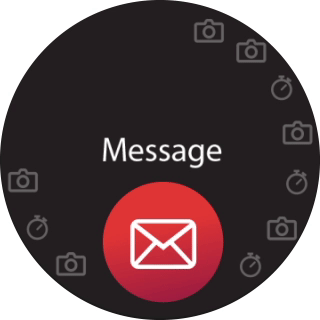
Several different concepts were explored for Notification, Call, Message, and Launcher interfaces. Unfortunately, the final concepts cannot be shared due to confidentiality concerns, but you can see a few examples of my final design below.
%20(1).webp)
Based on the findings from primary and secondary research, Design B was chosen as the final design option. The following guidelines were established for the design:
-
The navigation starts from the 12 o'clock position and follows a numerical or alphabetical structure.
-
Rotating the bezel clockwise represents forward movement, while rotating it anticlockwise represents backward movement.
-
The rotation of the bezel changes the position of the cursor, while the app icons remain fixed in their positions.
New design proposal for interaction and information architecture
The Samsung Gear S2 stands out with its world's first fully circular touchscreen, offering a more visually appealing and unique display compared to square-shaped smartwatches. What sets it further apart is the physical bezel design, allowing users to effortlessly navigate through notifications, third-party apps, and widgets on the small screen by simply rotating the bezel. The design scope encompasses both the UI and the physical user interface, including:
-
Physical User Interface: Designing the position, shape, and gestures of the physical buttons on the watch.
-
Landing Page: Developing an intuitive navigation experience to enable users to browse applications seamlessly.
-
Notification: Facilitating quick exploration of notifications through a frictionless bezel control.
-
Text Input: Optimizing the text input system for the circular screen of the smartwatch.
Based on ergonomic research, it was found that users prefer working with neutral postures that offer maximum comfort. When using a watch, the most comfortable gesture for users involves placing their index finger at the 1-2 o'clock position and their thumb at the 7-8 o'clock position. To avoid unintentional simultaneous button presses, both buttons were positioned on the right side, with the index finger button serving as the 'confirm' button and the thumb finger button for 'cancel' actions.
Ergonomics: the first circular screen with rotating bezel design watch

Gesture interaction mapping
Design A
Design B